“OSPREY IS, IN LARGE PART, ABOUT EXCEPTIONAL RELATIONSHIPS BETWEEN THE PACK AND ITS WEARER. THE PACK AND ITS MAKERS THE COMPANY AND ITS STAFF.” - Osprey’s Website
THE PROJECT: Develop an ad campaign.
MY SOLUTION: A campaign which would run in multiple magazines. This campaign would have a “make your own adventure” feature where customers could add their own pictures to the design.
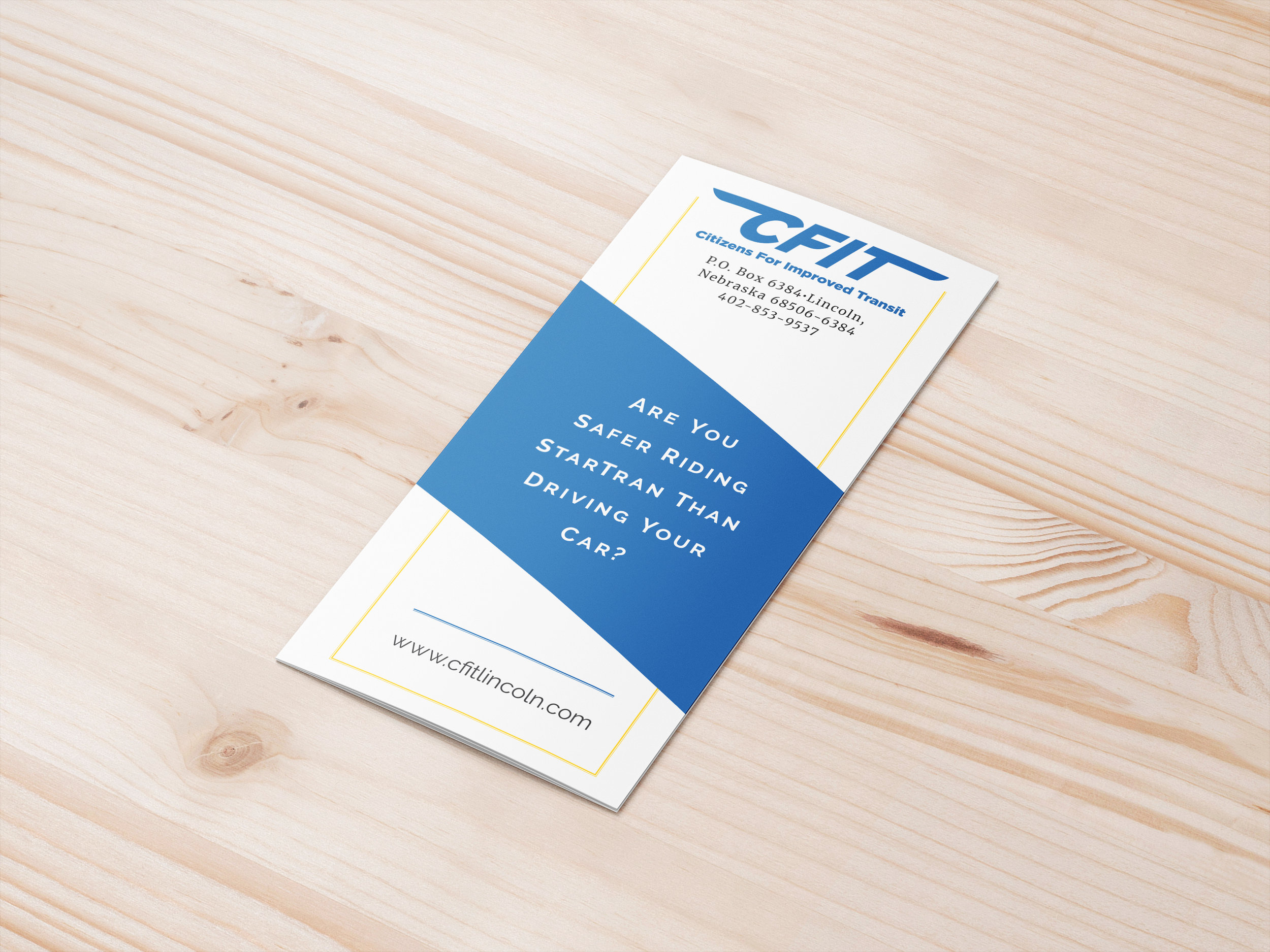
THE PROJECT: Build a trifold to advertise for CFIT (Citizens for Improved Transit) using the given blue with a pop of yellow. The original advertisement was on an 8x11 sheet of paper, one color, with text only.
MY SOLUTION: My first step was pulling out the statistics to bring forward the eye catching information. From there I developed the layout and pulled in icons and the photo to enhance the look.
The flyers were distributed locally to advertise the safety of the local transit system and hopefully encourage people to use local buses.
THE PROJECT: Create a wedding invitation that involves greenery.
MY SOLUTION: I wanted to keep the invitations focused more on the information with the greenery enhancing the copy. For the leaves I illustrated the leaves using a gradient to create depth.
THE PROJECT: Develop a shirt revolving around printing and/or printing presses.
MY SOLUTION: I used two tones to re-create Gutenburg’s original printing press. As I was illustrating the press I also replaced the area with the original name to OG which pays homage to both the original Gutenberg and the phrase, “Original Gangster.” This design won out of 20 designs and was produced by the class at a printing company.
THE PROJECT: Create a Google doodle based on a holiday.
MY SOLUTION: I illustrated the design keeping in mind traditional Hawaiian culture and added Kona beads to the lei of the “o.” I also have the stem of the “e” built out of the Hawaiian islands, so in a way the lava is creating the islands.
THE PROJECT: Develop a cohesive project to use in a professional show.
MY SOLUTION: Using Photoshop, I “painted” people to create a show that focused on the many different colors which make up skin tones. The tag line for the project was, “If we’re all made up of so many different colors, color shouldn’t matter.” I wanted to show another way in which we are all human and should be treated equally. For the show I pulled hues from each person such as purples, greens, etc. to show how varied skin tones can be.